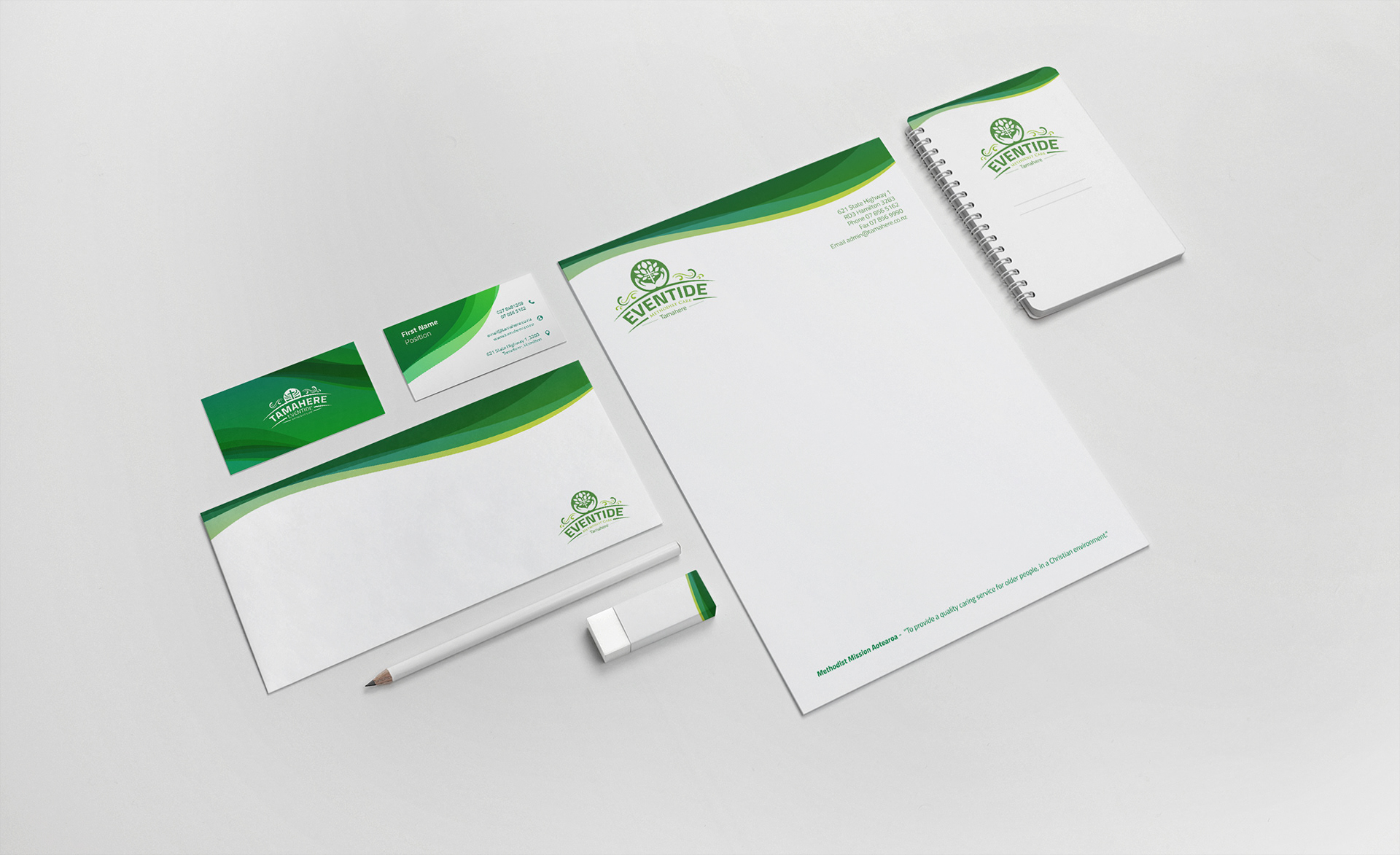
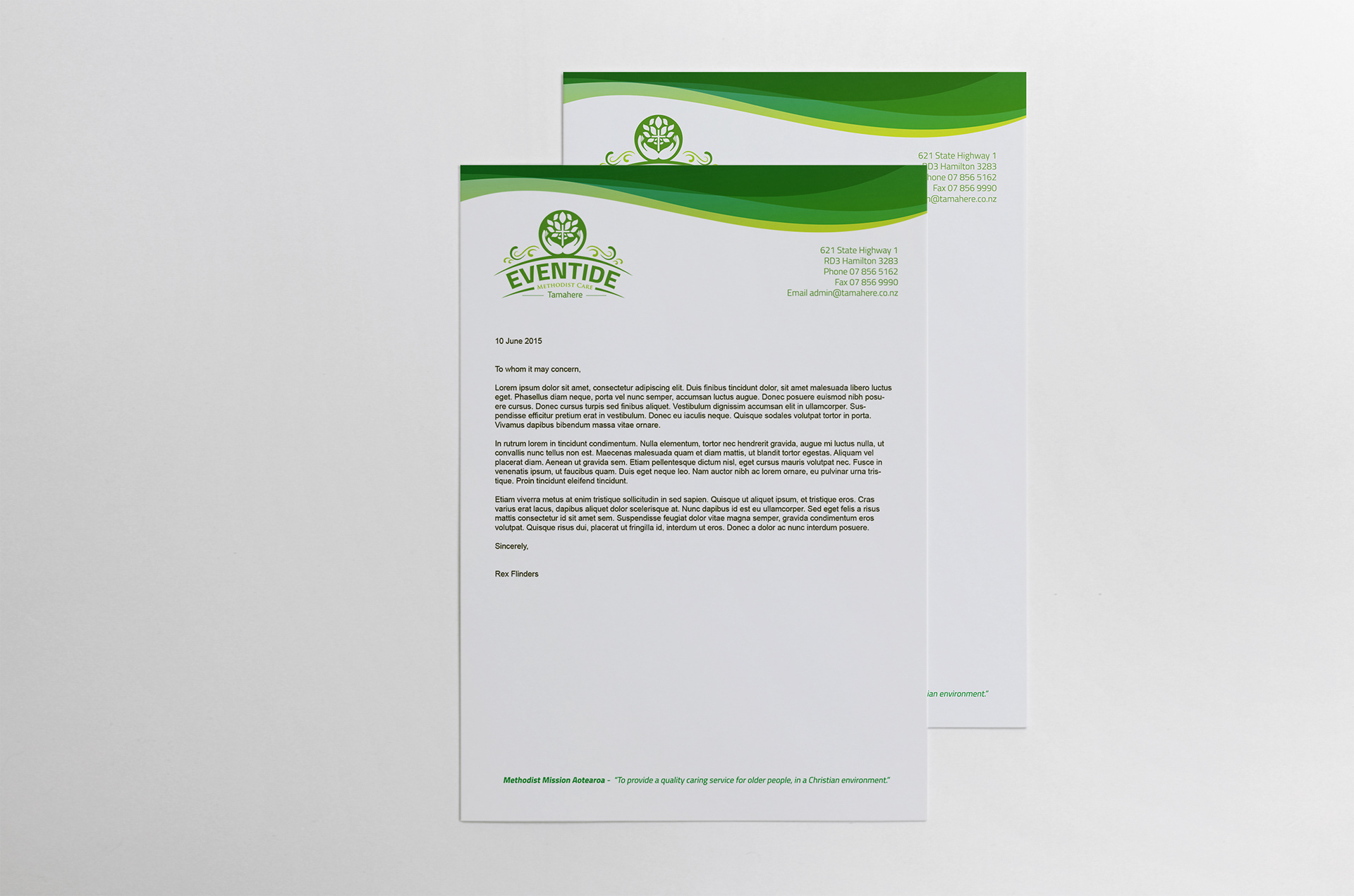
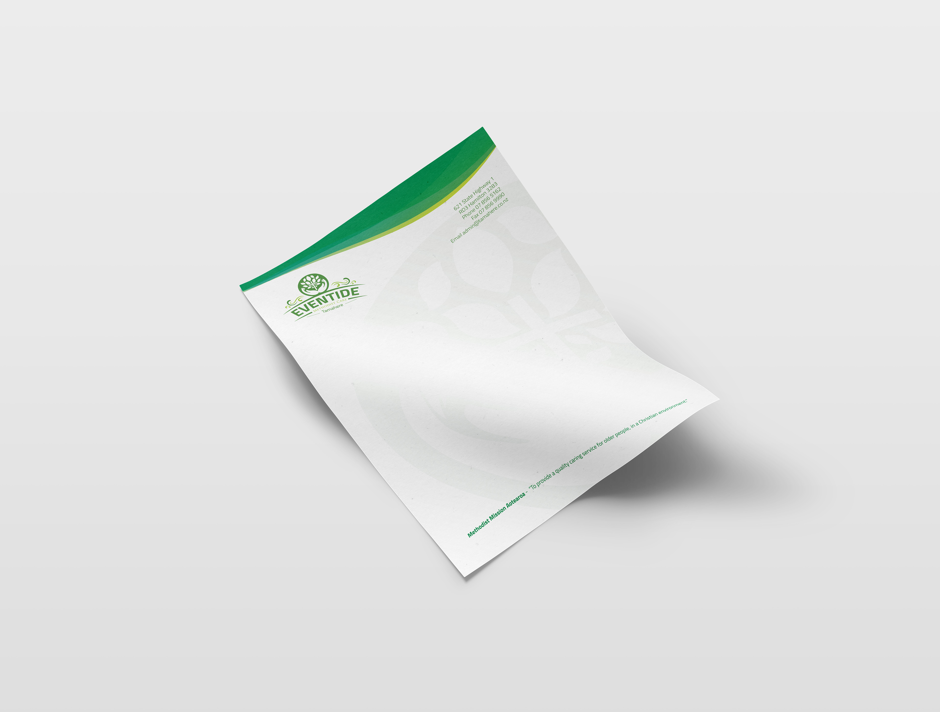
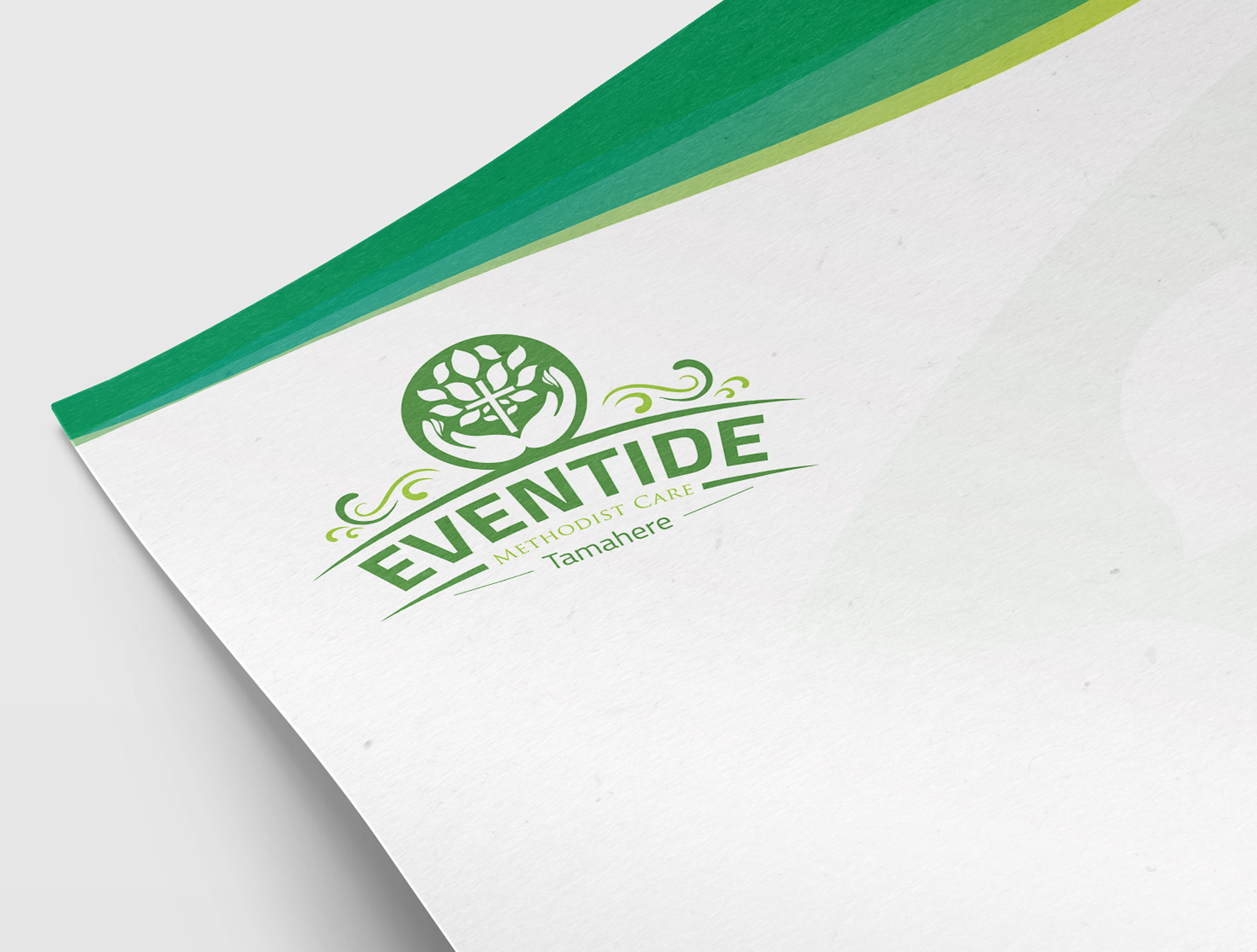

Freelance re-branding project done for a retirement home. Problem: The former branding was dull and was not able to supplement the visual enhancements taking place in the same environment as the branding. The client wanted the brand to convey their authentic love for nature yet deliver the crucifix device boldly. Solution: I used shades of green to bring a light and natural aesthetic that was asynchronous with the values of their organization. The smooth wavy lines resemble the grass and natural elements throughout the retirement home. The logo was created around the exact values of the christian organization.